None of us had a background in heavy industry
We were 5 students in an interdisciplinary team, with background in design-tech, hospitality, project management, business strategy, and design research.
None of us had worked in a heavy industry. We didn't know what a field service coordinator’s job actually involved, let alone what "staying on top of it" looked like day to day.
We learned the map before we met anyone on it
We went through the coordinator handbook, training materials, internal process docs, and the Salesforce systems coordinators worked in daily.
Terminologies, tools, responsibilities, all of it new.
This gave us our first real map: where coordinators sit between field engineers, clients, operations, sales, resource leads, and spare parts teams, and everything they're expected to hold together. Safety, cost, timing, across every job at once.
Finding the answer
After all that desk research, we had one question:
How do coordinators actually stay on top of their jobs, right now?
We went and asked, online, in person, across four regions:
9 online interviews
with coordinators across North Europe, Africa, Central Europe, and Oceania.
8 face-to-face interviews
during a field trip to Singapore.
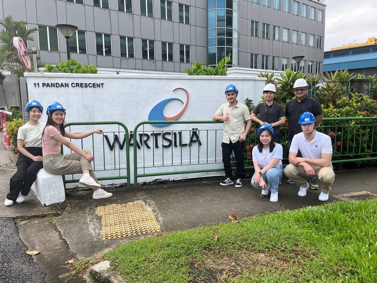
A group picture with field coordinators after the interview.
7 observations
to understand their systems, observe their day-to-day coordination activities.
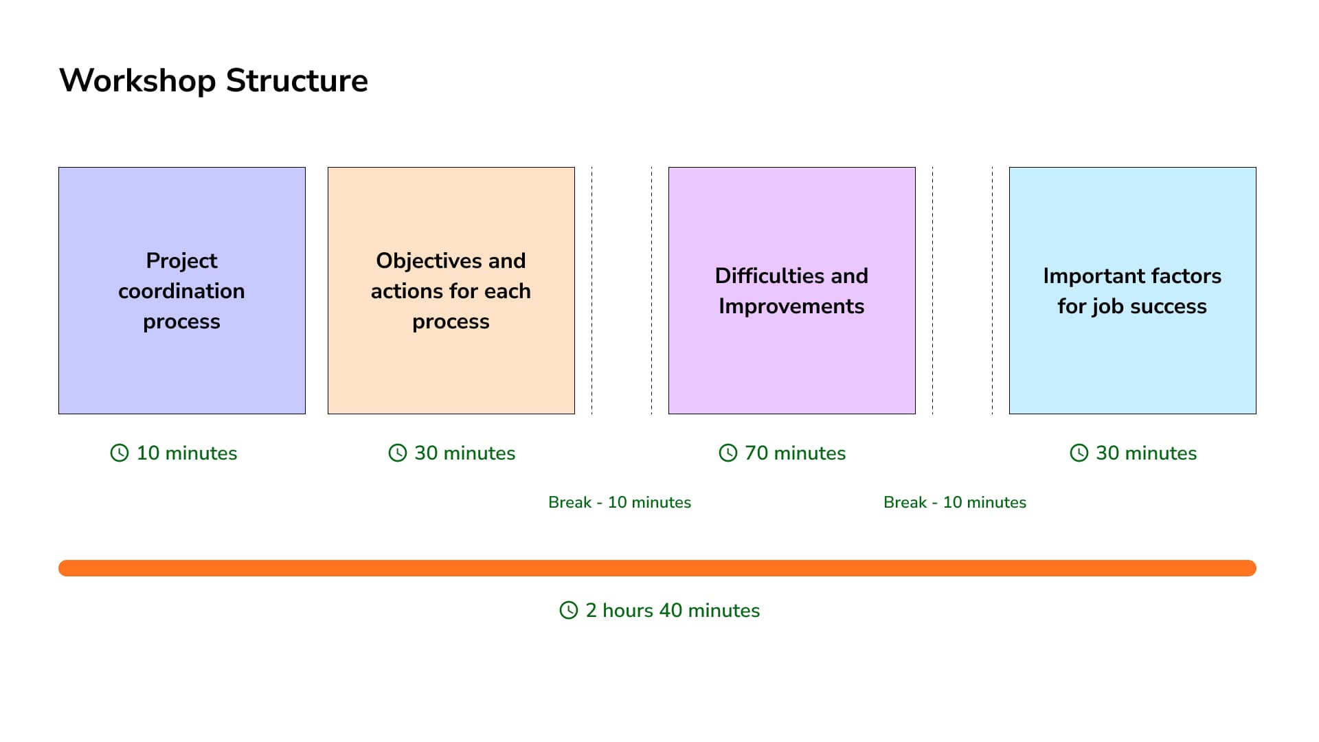
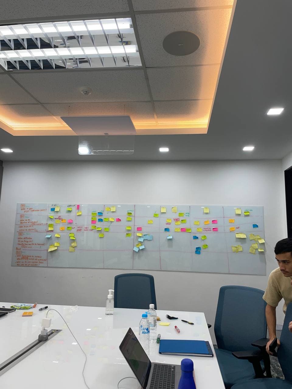
1 joint workshop
with coordinators, operations leads, and resource leads.
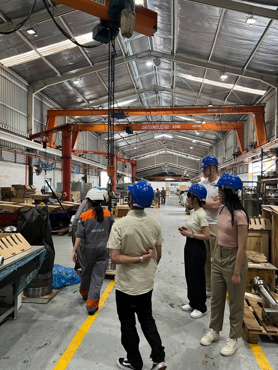
and a trip to their workshop
to see the kind of equipments and parts being serviced.
I ran the interview and observation notes through a single Microsoft Notebook space instead of the usual scatter of docs, and we used FigJam to make sense of it all together.
💡 I learned to run an ethics self-assessment before designing the research, build a consent process, and plan how we'd anonymize and store what we collected, following GDPR guidelines.
What did we find?
Information lives scattered across different systems
Everything a coordinator needs like installation details, workscope details, vessel schedules, spare parts tracking, booking information, lives scattered across different systems, and a lot of it changes constantly, outside their control.
Consolidating everything in one place
But everyone had built their own version of that philosophy:
- Excel, because it's the only place they could structure information exactly the way they needed, even though no two coordinators' sheets looked alike.
- WhatsApp, because it kept them in "close and continuous contact" with engineers on-site , even though messages could be deleted.
- Teams folder because entire team could access the files and everyone was familiar with Teams.
- Folder structure in emails and desktop because they could categorize by customers and vessel name and didn’t have to spend time finding related documents and files.
- Notes, because, "Instead of opening a document every time, it's easier for me to see the Notes", even though every entry had to be typed in by hand.
- Paper notebooks, because writing things down helped them remember, even though a notebook can't be searched, and has to be carried everywhere.
In addition to consolidating information, they also utilized pre-briefing meetings, emails, daily reports to communicate and calendars, reminders to keep things moving.
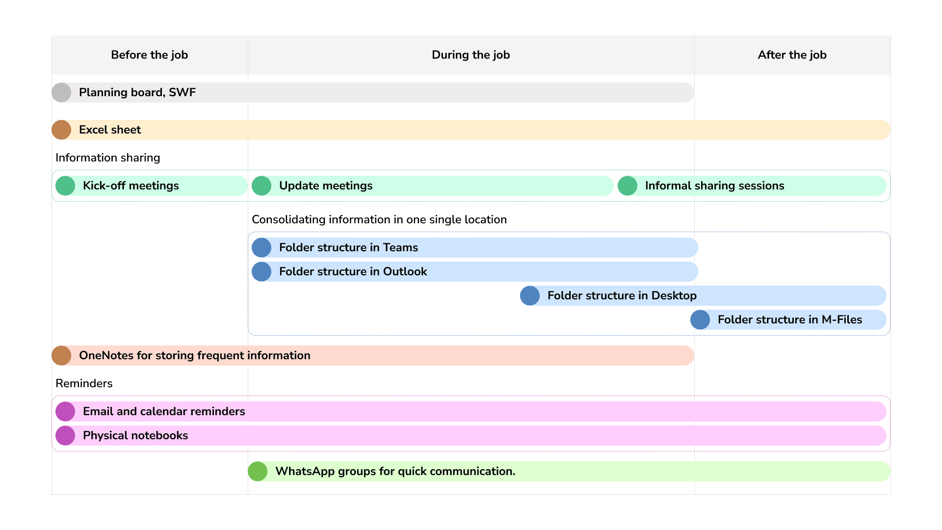
Each way of consolidating was personal, manual, and constantly out of date, which, across 25 simultaneous jobs, meant most of a coordinator's time went into collecting and updating information instead of using it.
HMW we help coordinators see all their jobs at a glance, without them having to consolidate it by hand?
And a harder truth sat underneath all of it: a lot of what actually derails a job (a delayed spare part, a vessel's schedule shifting) isn't something a coordinator can influence at all.
Early crazy ideas
Our first instinct was to build coordinators a workspace.
A drag-and-drop work area
The idea with this one was that the coordinators would drop their Excel files, notes, and photos onto one shared screen, pulling in mail and even WhatsApp images through plugins. It would be like a Miro board that engineers, resource managers, and sales could all edit together. Open one thing, and never open anything else.
A common view plus a personal view
Everyone working a job could see one shared status view, what's delayed, who's involved.
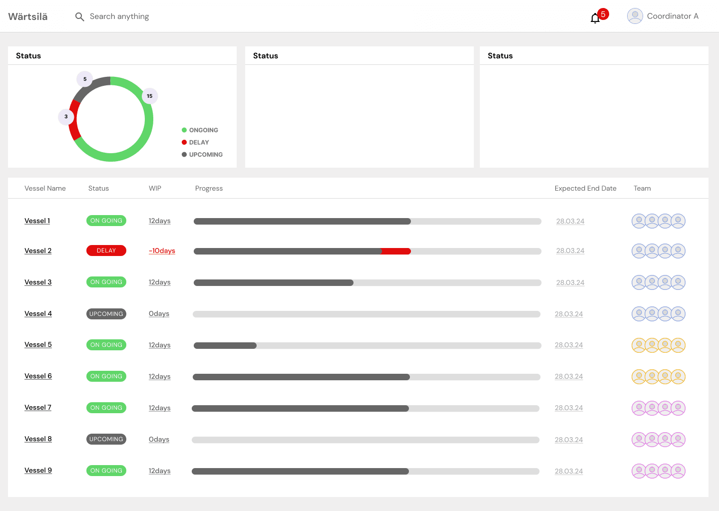
A common view for everyone involved in the job.
Each coordinator also got a personalized dashboard of just their vessels, with tasks, notes, and a calendar underneath each one.
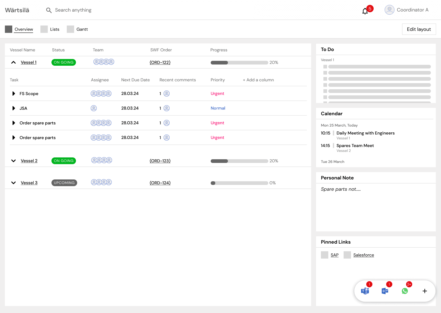
Personalized dashboard involving only the jobs that the coordinators are responsible for.
Expose the problems, don’t solve them
We were ambitious. Also, as we'd soon learn, aimed at the wrong problem.
A conversation with faculty and our Wärtsilä contact reframed things: this was a multidimensional problem. The tools, the nature of the responsibility, the nature of the data itself, that no single tool would fully solve.
We stopped trying to fix communication, we started showing what was true
So we shifted: build something that surfaces what's going wrong, fast, so the coordinator (who already knows their job) can act on it.
I went back into the Salesforce tools coordinators already used, this time looking at how they took action inside them, and leaned hard into the Gantt chart format most coordinators had already built for themselves.
We visualized current and upcoming jobs, coloring activities red or green, and letting a coordinator hover over a problem to see what broke and what an engineer had said about it in their daily report.
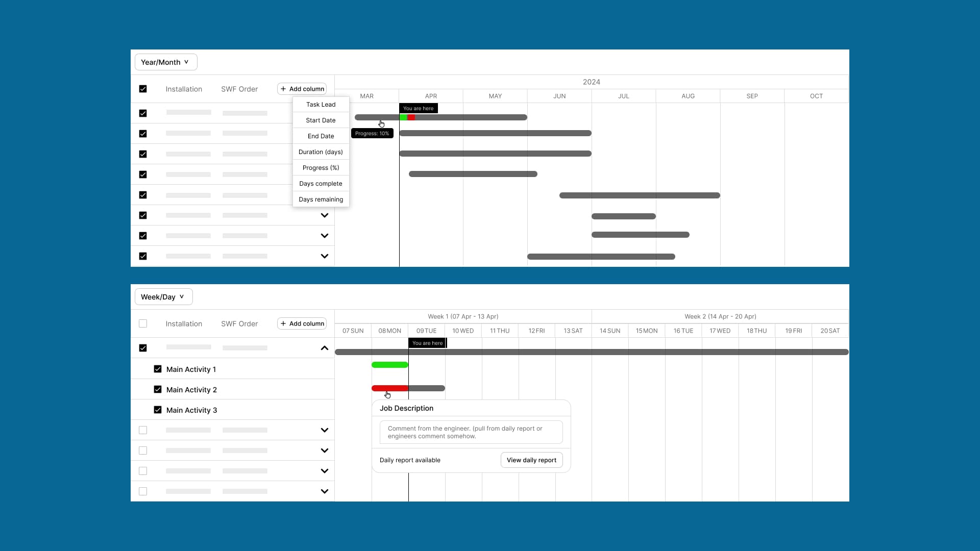
We shaped the direction into three possible progressive paths:
- Transparency - pull every scattered data point into one view, shaped the way the coordinator wants it.
- Shared Space - a common, collaborative view for every stakeholder on a job, with shared documents and task ownership.
- Automated AI - an assistant that summarizes a job before a final report is due, and flags upcoming risks based on past jobs.
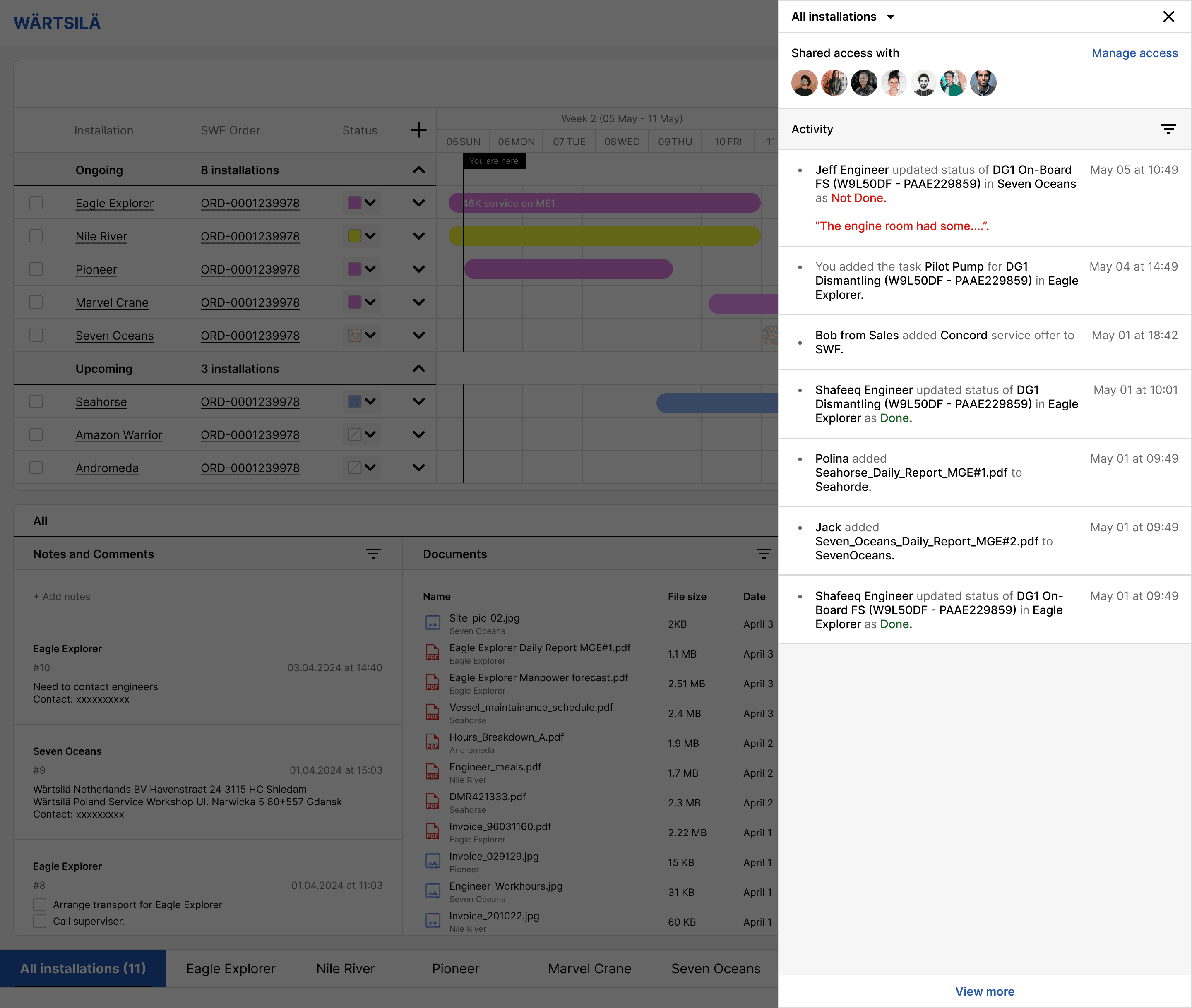
Shared Space concept
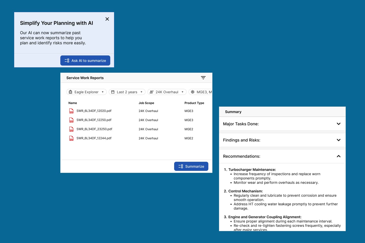
Assistant to help summarize past jobs and ongoing jobs.
We presented our vision at the midterm presentation.
Wärtsilä gave us a green light, but to focus mostly on the coordinator's own view, not the shared or AI-driven directions (i.e., Transparency).
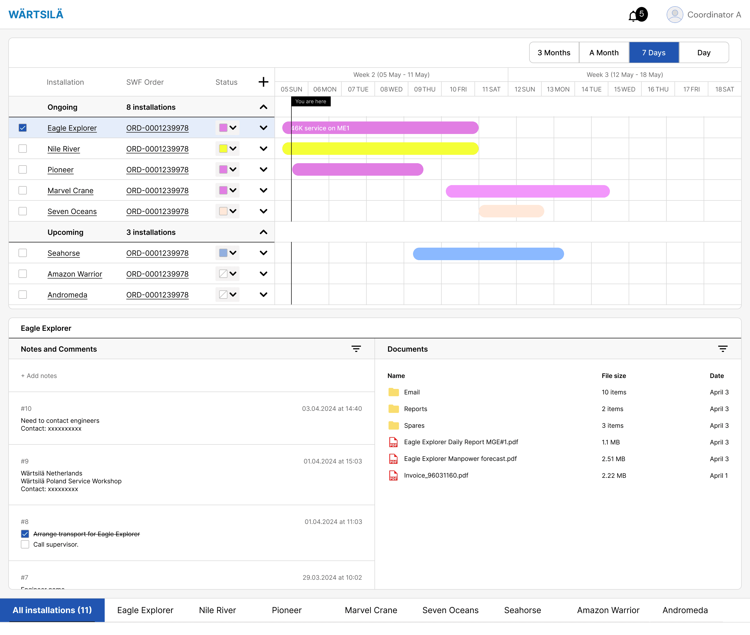
💡 I followed excel’s bottom navigation to make the screen familiar to interact.
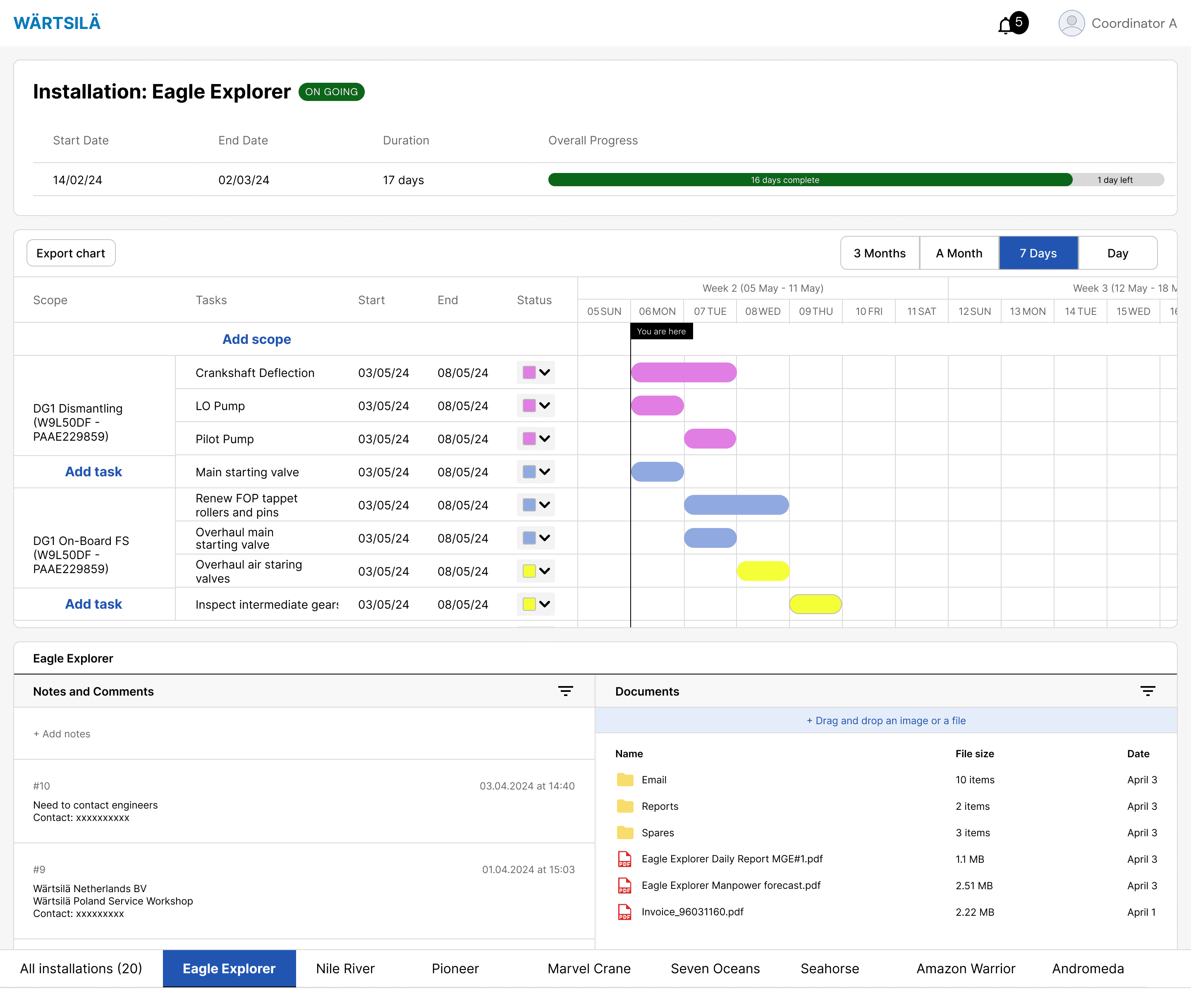
The detailed view included relevant documents and files, ability to add notes, and add tasks relating to the service job.
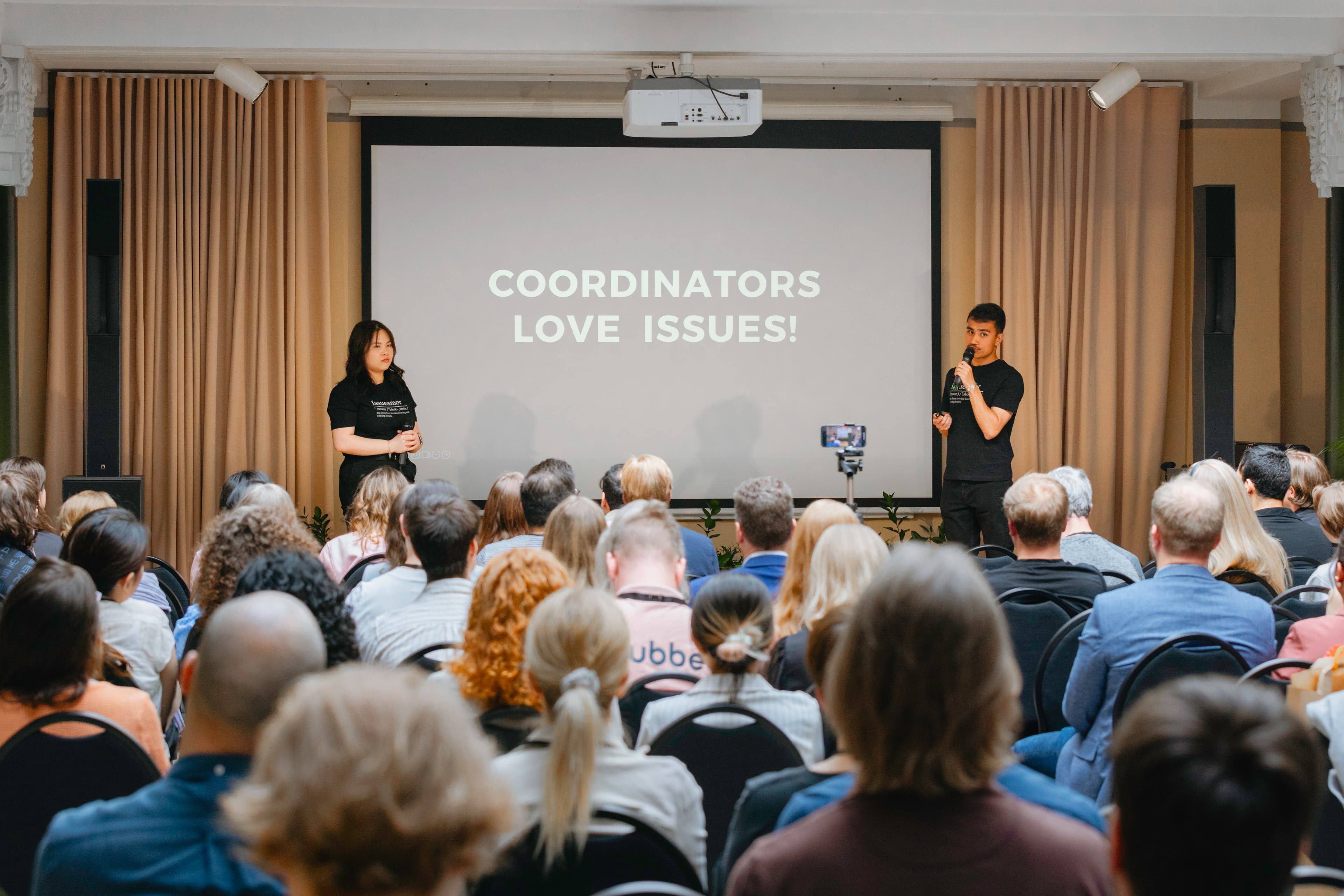
We handed off the work by presenting the concept to an audience of 80+ people in IDBM Impact Gala, including the stakeholders from Wärtsilä.
Gut punch: right findings, wrong context
I joined Wärtsilä as a summer trainee, this time with full access to Wärtsilä's systems.
As I started learning more about the processes, systems, I could see what our student team had gotten slightly wrong.
We asked good questions. Some of them had already been answered
We'd had no visibility, as student consultants, into everything else already happening inside Wärtsilä — including some features we had built that already had a home in other tools.
It took me three months of re-learning terminologies, sitting inside Salesforce, mapping how the pieces actually fit, before the context we'd built from outside the company started to hold up.
The reframe
I started thinking of the tool less like a workspace and more like a car dashboard.
A dashboard tells you what's going right and what's going wrong, it doesn't let you fix the engine from there. You still have to press the pedal, change the gear, somewhere else. The tool's job was to show the status, not host action.
With that perspective in mind, my coworker and I scoped what the tool should and shouldn't do, and I started designing.
I studied the Salesforce Lightning Design System so the tool could live convincingly inside their existing environment, and built out the prototype.
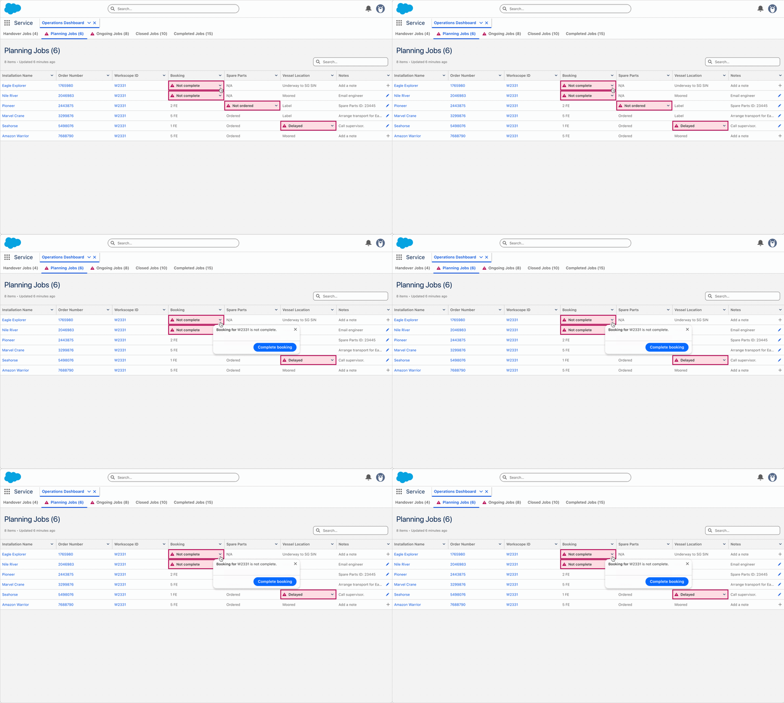
Operations Cockpit — helping coordinators find issues to solve
- Job phases as tabs: Handover, Planning, Ongoing, Closed, Completed, each with the data points and states that mattered at that stage.
- A tabular view, using the same red/yellow/green urgency logic coordinators were familiar in their Excel sheets.
- Every status backed by an action prompt, linking out to wherever the actual fix lived.
- A simple note-taking column for the information no system captured.
Where it landed
We tested the redesign with 10 coordinators. 90% responded positively. We built a business case around the friction this could save.
We presented the business case and it was accepted for implementation
That's where my contribution ends. I don't have hard numbers on time or cost saved; that wasn't measured while I was there.
I left behind a validated concept and a clear philosophy for what it should and shouldn't do, not a shipped product.
What did I learn?
Context isn't something you can fully research your way into from the outside
Some of it only becomes available once you're inside the system, living with its terminology and its politics.